[Ming River]
Ming River visual identity
Ming River visual identity

[Overview]
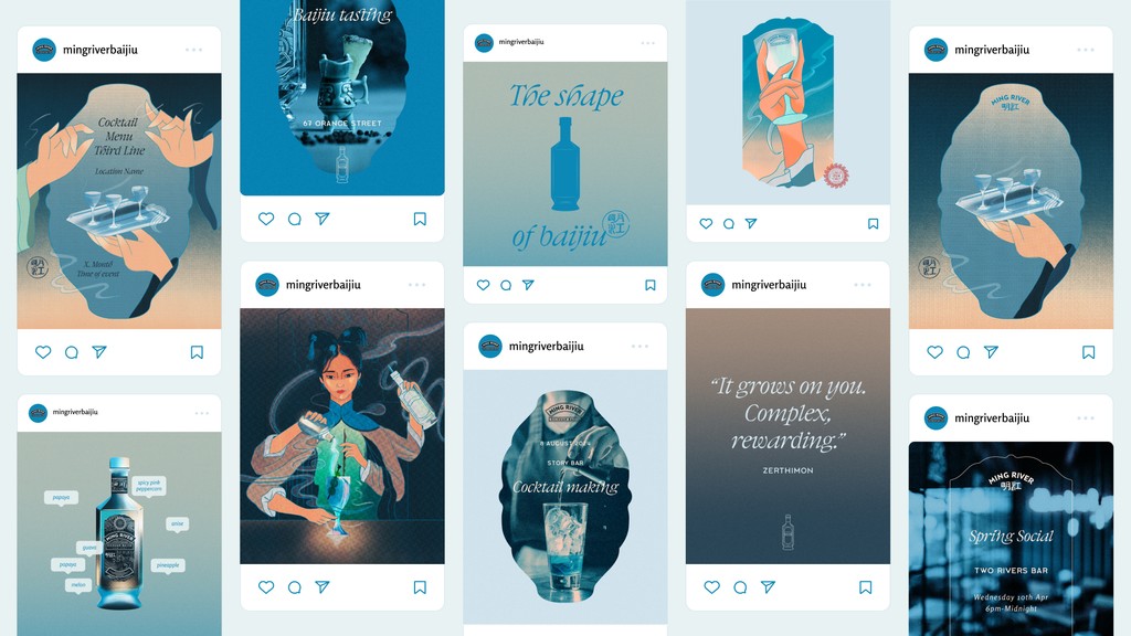
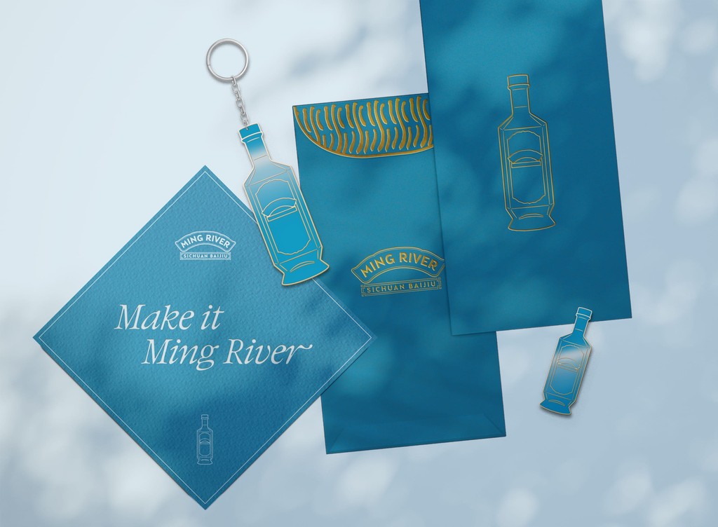
Ming River, a Sichuan baijiu brand called for a brand refresh. To expand beyond the bottle and create the visual identity around everything Ming River.
Our design approach reflects the celebration of Sichuan baijiu and bridging the gap of the negative to uneducated perceptions a lot of people have on baijiu as a spirit category, by bringing the heritage and cultural narrative to educate people on Sichuan baijiu and Ming River.
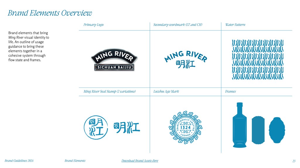
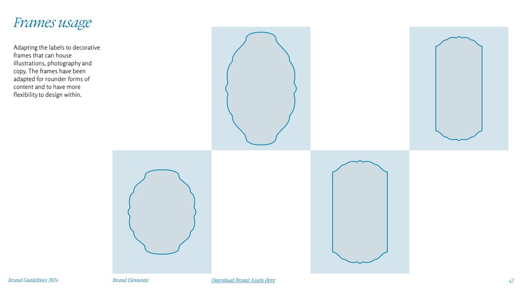
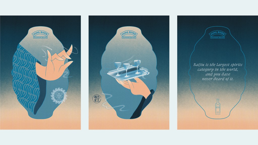
To bring the design approach into a tangible graphic system, we explore frames and the flow state. Bringing fluidity into the branding to create the feeling of harmony—and the elements of liquid, steam and clouds together— in combination of traditional frames to create a concoction of ingredients from tradition and modernity together.
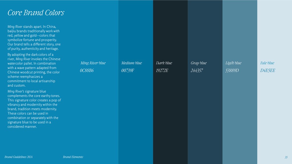
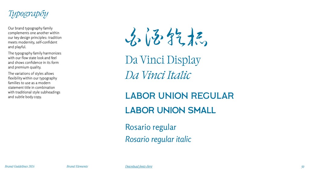
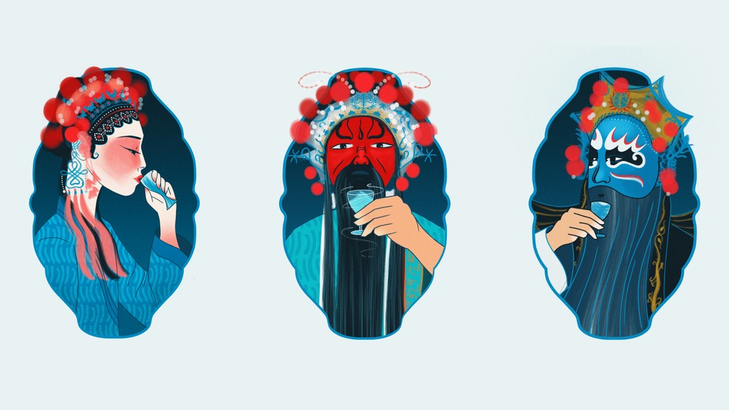
Refocusing on the core design principles and tone of voice we explore the flow state visual identity and give a modern twist to the traditional with a new revamp of brand type and core brand colours. Reinstated purpose for the seals and stamps and introducing playful illustration paying homage to Sichaun opera and heritage.
An ongoing interview series published on Instagram by Celestial Peach. Part of 41 artists to help visualise foodie stories answering to ‘What does home taste like?” Illustrations encapsulating interviews with Sandy Tang and Maggie Zhu.
View the whole online exhibition by Celestial Peach here
